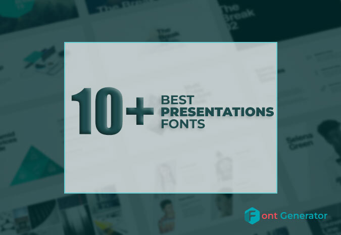
Design choices for PowerPoint presentations. The colors, icons, photography, and illustrations you use all contribute to the overall style of your presentation. This also includes the fonts you use. It is essential to choose the best font for presentations that align with the rest of your design and conveys the right message. The right font can significantly impact your presentation’s overall look and feel. Finding the Best Fonts for Presentations can take time and effort, considering many factors. But with this list, you’ll be sure to find the perfect and best Presentation Fonts For Powerpoint.
List of Best Fonts for Presentations
Following is the list of best font for presentations:
- Lato
Lato is a sans-serif font family designed by Łukasz Dziedzic. It was released in 2010 through the Polish foundry typoland.com. The family contains six weights:
- Light
- Regular
- Bold
- Black
- Hairline
- Ultra Black
The hairline and ultra-black weights are not as widely supported as the other.
Lato’s name means “summer” in Polish. The designers have said that they wanted the font to evoke the warmth of summertime.
The Lato family has been used by companies such as Google, Microsoft, and Apple Inc. Google’s Android operating system uses the Lato font for its user interface. Microsoft’s PowerPoint presentation software also uses Lato as its default sans-serif font. Apple Inc.’s Pages word processing software uses Lato for body text.
Lato is available under the SIL Open Font Licence, which can be used for personal and commercial purposes without restriction. The license allows for modification and redistribution of the font.
- Open Sans
Another great font that works well for PowerPoint presentations is Open Sans. Since there is some space between the lines, it is easy to read. It’s the best choice if you have long paragraphs that you can’t break up with bullet points. Since it’s a standard font for PowerPoint, you probably already have it in your font library.
- Candara
Candara is not a font you see every day. Since it is proprietary, you can’t use it in Linux or on the web. However, you can use it in PowerPoint. What makes it interesting are the curved diagonals, which give it more personality.
- Tahoma
Tahoma is a very formal font made for Windows 95. It works well for business presentations. It’s a clear and easy-to-read font that can help keep things from getting confusing. This makes it great for formal exhibitions that need to be precise.
- Garamond
Garamond is not a specific font name but a font style. You may have heard of Adobe Garamond, Monotype Garamond, and Garamond ITC as some examples. All of these fonts are a little bit different, but they all come from the work of Claude Garamond. He made the first punch cuts in the 1500s, which makes Garamond fonts some of the oldest.
Before Claude Garamond’s work, fonts were made to look like scribe’s handwriting. On the other hand, Garamond’s typefaces were made in the Roman style, with the letters ascenders being straight and the crossbar of the letter ‘e’ being horizontal instead of slanted like earlier calligraphic fonts.
The letters were made this way to make them easier to read in print. This is why Garamond fonts are so good for body text. Garamond fonts have been used outside of the image in the logos of many brands, such as Rolex, Abercrombie & Fitch, and tech giants Google and Apple. Adobe Garamond is such a good choice that the entire Harry Potter series is printed on it.
Because Garamond fonts have a long history and are easy to read, you can be sure that they will add a timeless elegance to your slides while keeping the text easy to read.
- Palatino
Hermann Zapf came up with the idea for Palatino in 1949. Palatino is a typeface based on the style of the Italian Renaissance. It was named after the master calligrapher Giambattista Palatino, who lived at the same time as Claude Garamond.
Zapf made Palatino so it could be used in headings, ads, and printing. More specifically, it was made so that it could be read even if printed on cheap paper, made small, or looked at from far away.
Palatino Linotype is the font version that comes with Microsoft PowerPoint products. It has been slightly changed from the original version to look best on screens. Book Antiqua, also one of Microsoft’s default fonts, looks a lot like Palatino Linotype and is almost impossible to tell apart.
- Verdana
Matthew Carter made Verdana in 1996 for Microsoft. It was made to look good on computer screens. This font is very easy to read, even at small sizes, because the letters are far apart and have expansive counters and tall lowercase letters.
Verdana is another font that is almost always used. Since it was made, it has been included in all versions of Windows and Office. According to a survey, it can be found on 99.7% of Windows computers and 98.5% of Macs.
On the one hand, this makes it a very safe bet because you can almost be sure that your presentation will look the way you want it to on all devices. On the other hand, you might stand out less than you’d like.
But you can’t argue with how easy it is to read. Verdana is an excellent font for small text, like footnotes, references, and disclaimers, so they are easy to read. Or, if you want to play it safe, choose Verdana. Its simple, easy-to-read characters will keep your audience’s attention on what you say, not your font.
- Whitney
Whitney is a great font that will make your presentation stand out. Whitney can be used for header and body text, but we find it too busy for PowerPoint paragraphs. You can choose between Whitney Narrow and Whitney Condensed.
- Oswald
Oswald is a good sans-serif font in three styles: light, regular, and bold. It has some modern elements and a classic gothic style, which makes it an excellent choice for PowerPoint presentations.
- Segoe
If you’ve used a Windows computer, Skype, an Xbox 360, or even the Microsoft logo, you’ve seen a font from the Segoe family. Microsoft’s logos and marketing materials are made with Segoe fonts, and since Windows Vista, Segoe UI has been the default font for the operating system.
This is because it is so simple and easy to read on a screen. Like Verdana, Segoe fonts look great on screens and in small sizes. They are warm and inviting while still having technology’s airy, progress-oriented feel.
On the other hand, Segoe fonts are great for titles and headers, unlike Verdana, which has a lot of space between the letters and thicker ones.
The many symbols and icons that come with the Segoe font family are another fun thing about it. From PowerPoint’s insert tab, click the logo, change the symbol font to either Segoe UI Symbol or Segoe UI Emoji, and be amazed at how many characters you can choose from.
Almost any sign you could want is probably in there. There are shapes, arrows, musical notes, mathematical notation, scientific notation, animals, buildings, food, Mahjong tiles, Fraktur letters, and I Ching hexagrams…
So, the Segoe font family is an excellent choice for easy-to-read body text, elegant and light headers, and a quick and easy way to add any icon to your presentation.
- The Franklin Gothic
What is it about a font that makes it “gothic”? Franklin Gothic has nothing to do with bats in bell towers or doomed lovers wandering the Yorkshire moors. Well, it’s confusing that “Gothic” can mean two very different things when talking about fonts.
Sometimes it means a blackletter font in the style of the Middle Ages, and sometimes it means a clean, geometric, sans serif font that became popular in the early 19th century. And Franklin Gothic is definitely in that group.
Franklin Gothic is a classic American font made by Morris Fuller for the American Type Founders in 1902 and named after the American printer and Founding Father Benjamin Franklin. It has been called “square-jawed and strong-armed, yet soft-spoken.”
With its wide range of weights and widths and exciting design details (check out the uppercase Q and lowercase g for beautiful, unusual curves and the uppercase A and M for slightly different line weights), Franklin Gothic will look solid and friendly as your headings and classy and readable as your body text.
- Europa
It depends on you. The Adobe Font Family has a great font called Europa. It’s a modern geometric sans-serif font that works well with other Adobe fonts but can also be used with other companies.
- Roboto
Roboto is one of the most helpful web fonts because it comes in 6 different styles. It’s the default font for Google Maps, and it’s called a “grotesque sans-serif.” It works well for short readers but could be better for titles. It’s great for body texts where scanning is critical because it’s easy to read.
- Bodoni
Giambattista Bodoni was a master printer who lived and worked in the Italian city of Parma at the end of the 18th century and the beginning of the 19th century. Like Garamond, Bodoni is not a single font but a family of fonts based on the work of a master typographer from hundreds of years ago.
Bodoni and a French typographer named Firmin Didot were the ones who came up with the “New Face” style of lettering, which is made up of lines that are both very thick and very thin.
If you’ve ever looked at a fashion magazine, you’ve seen this at work. The names of Vogue, Harper’s Bazaar, and Elle are all written in a font called Bodoni. These fonts are used so often in fashion graphic design that they have become shorthand for the elegance and sophistication that the fashion world admires.
Bodoni fonts could be a stylish and sophisticated solution if you need to layer text over photos. People have compared the sharp edges and smooth curves of these fonts to the precise geometry of fabric patterns, and their delicate, graceful shapes give them a sophisticated femininity.
Because they are so soft, these fonts are also great for putting over photos. On the covers of fashion magazines, you can see that the titles are still there, but they don’t take over the picture. You can use this to affect your designs significantly.
Bodoni fonts will give your design an instant air of effortless, timeless elegance. They work best in large headings where different line weights will impact the most.
Bodoni himself wrote that “conformity without ambiguity, variety without dissonance, and equality and symmetry without confusion” are the things that make a type beautiful. Bodoni fonts have many of these things and are some of the most beautiful fonts you can use.
- Bebas Neue
Bebas Neue is one of the best fonts for headers in PowerPoint. It has five font weights, which is a good number. Bebas Neue, on the other hand, only comes in capital letters, so there are better choices for body text. Think about this before using the font.
- Show Fairness
Most of the characters in this font stay between the baseline and the X-height. This means that most letters stay within the line. Many fonts that try to have the “box look” are hard to read from far away.
Playfair Display avoids this problem by giving the stems of their letters different thicknesses compared to the arms and other extensions. This makes the letters stand out more.
Playfair display is a classy and elegant font made for titles and headers. You can still use it in paragraphs, but you should use it only in shorter text parts.
Some people need clarification to read words that are all the same size and have the same amount of space between them. So, think about using Playfair Display as the font for your presentation’s titles, quotes, and subtitles.
How do you choose the best font for presentations?
Want to make your next presentation more interesting? One way to do this is to choose a font that stands out or is interesting. But there are so many fonts out there. How do you pick the best font for presentations?
When choosing a font for your presentation, here are a few things to consider:
- What is your presentation about?
If you want your presentation to be fun or lighthearted, you can be more daring with your chosen fonts. Choose a more subdued font if you’re giving a severe presentation on a sensitive subject.
- How do you sound when you talk?
You should pick a font that fits the mood of your presentation. Is it a casualor formal event? Are you creative or professional?
Your audience. Think about who you’re writing for and what might interest them. If you’re giving a presentation to a group of designers, they may like it if you use a more creative font. But if you’re giving a presentation to a group of business leaders, they might want a more traditional font.
- How long will your Speech be?
If you’re giving a long presentation, choose a font that’s easy to read. That means you should avoid fancy, script, and decorative fonts that could be hard to read on a slide.
- How does your presentation look as a whole?
Once you’ve chosen a font, step back and look at your presentation. Make sure the font you choose goes well with the other parts of the design.
Choosing the right font for your presentation can distinguish between a boring slideshow and an attractive, visually appealing presentation. You can select a font that will make your presentation look its best by thinking about its topic, tone, audience, and length.
Conclusion
Our blog has shown you that choosing the best fonts for presentation that can help you reach the goal of the display. We recommend you the best font generator (Fontgeneratorapp.com) for using the Best Presentation Fonts. These good fonts for presentations are professional and stylish, so using them in your PowerPoint slides can make the whole production look more professional. Visual Spiders can help you make presentations that get people’s attention. Never be afraid to contact us if you need help with the best font for PowerPoint presentations.